CASE STUDY 003 · EPLAN SERVICES
A retirement dashboard that worked against its users.
401(k) investors were making real-money decisions in an interface that was error prone and overly complex. I redesigned it end to end, research through developer handoff, for everyone from first-time savers to hands-on investors.
OUTCOME — errors −60% · support requests −29%
- Product Designer & Researcher
- Me · 1 PM · 1 product owner
- Spring 2021
- 401(k) experience, responsive web
- Audit · research · hi-fi · handoff
THE PROBLEM
The product wasn't broken, but the tool was confusing.
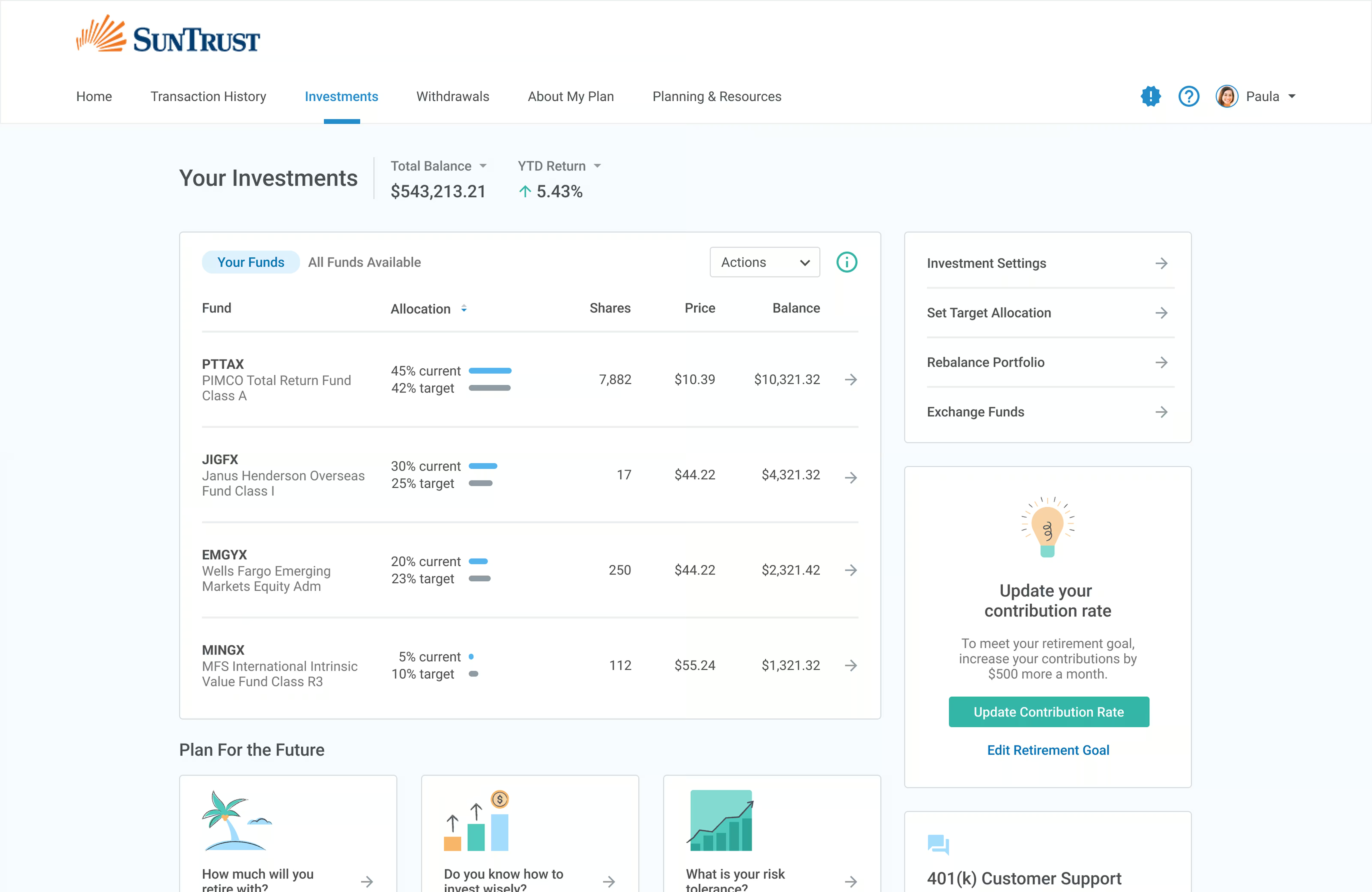
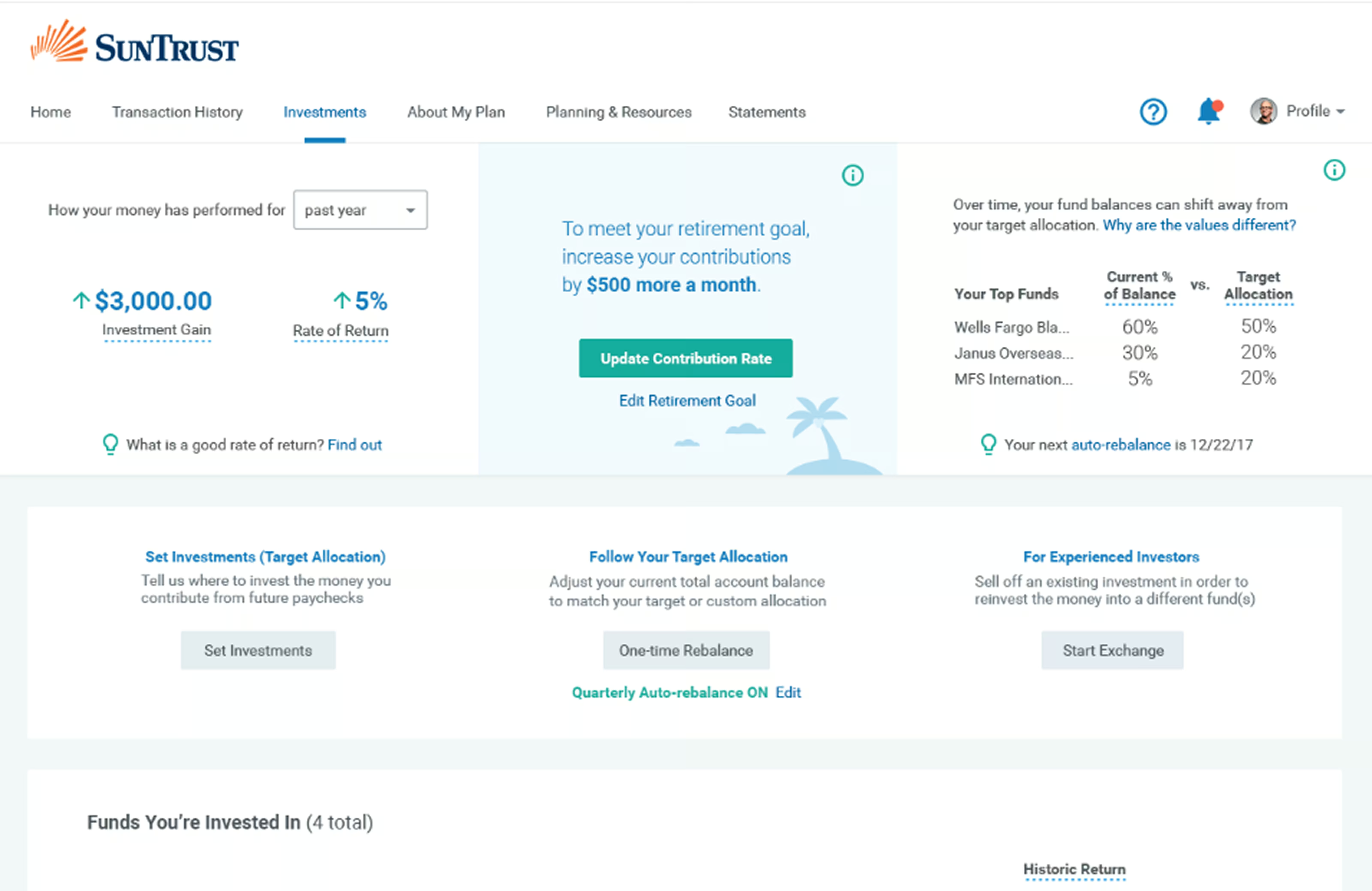
ePlan Services runs 401(k) plans, however their investment tool was generating confusion, mistakes, and a steady stream of support tickets. Retirement investment is hard enough on its own and the existing interface was creating additional unnecessary friction.
I began by running an audit and clustered findings into four themes.
WHAT THE AUDIT TURNED UP
- 01
Information overload. Dense screens with no hierarchy to communicate what a user should pay attention to first.
- 02
No scaffolding for less confident investors. The product assumed you already understood investing principles.
- 03
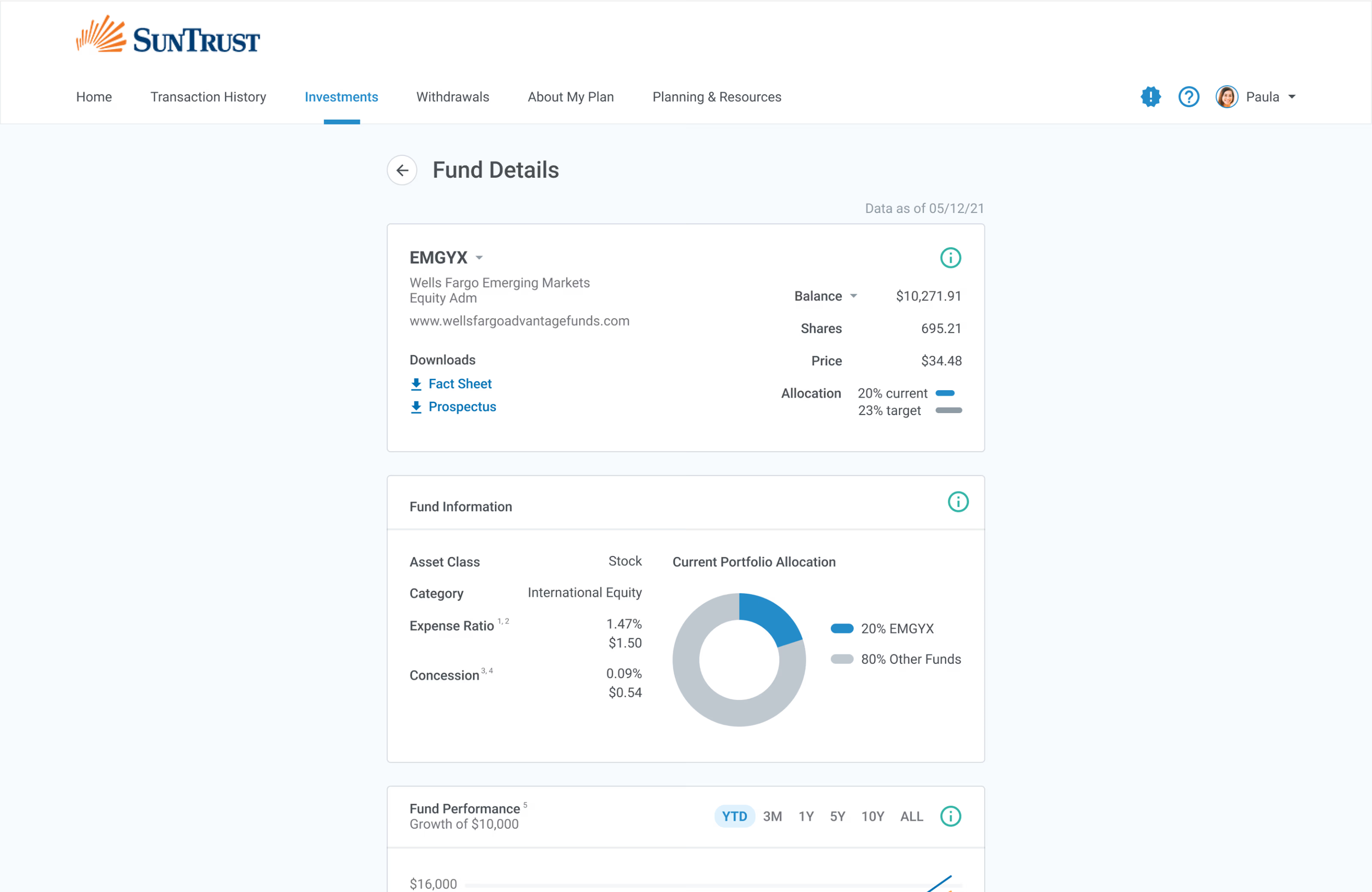
Data visualization that was too thin. People left the product to compare funds to invest in.
- 04
Inconsistent patterns across flows. Every screen within the platform made you re-learn it.
WHERE IT STARTED /
WHERE I STARTED
I began with three hypotheses to help orient the work and give me something measurable to test my designs against.
Instead of redesigning on instinct, I committed to three hypotheses before any design work started — partly to point the work somewhere, partly so the usability test had something concrete to confirm or kill.
- H1
Financial efficacy. Put literacy tools inside the product and people make better retirement decisions.
- H2
Error reduction. Make the management flows simpler and more sequential and people make fewer mistakes on the high-stakes ones.
- H3
Informed decisions. Surface the key comparisons clearly and people stop leaving the product to feel confident.
Generative user research exposed the range of users we’d have to accommodate. The same product served a small-business owner who used a financial advisor, an employee on a tight budget with little investment experience, and an accountant auditing their portfolio each month.
Designing for the median wouldn’t have addressed each user types needs. Therefore I committed to redesigning the information architecture to flexibly accommodate for varying literacy levels.
THE STRUCTURE
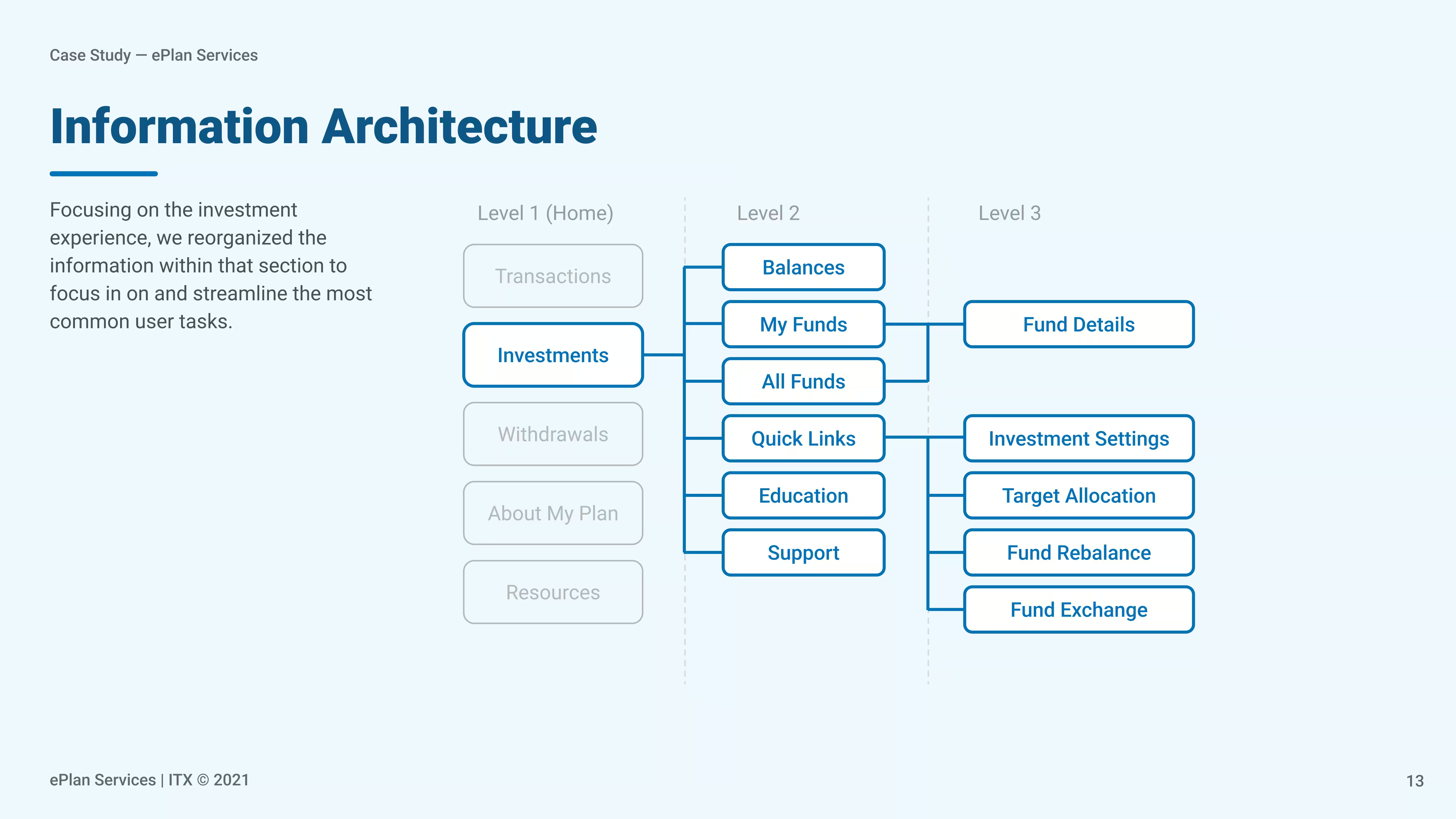
The information architecture was redesigned across three levels.
I rebuilt the IA around three levels, each tied to an intent. Within the investment app, the care surfaces were: balances, my funds, all funds, education, and support. The high-consequence actions got pulled into a flow of their own.
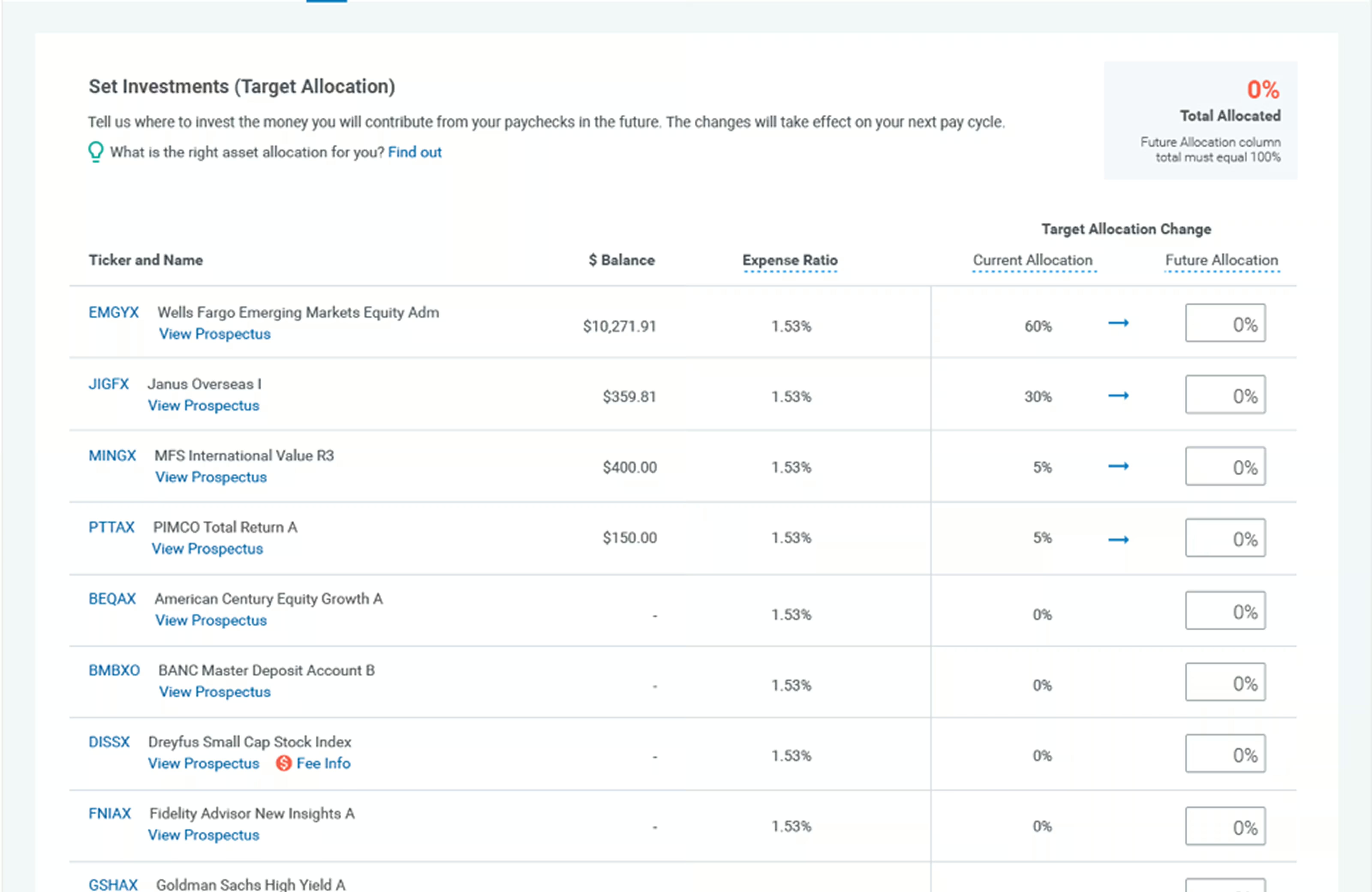
What I focused on was separating viewing investments from acting on them. The old interface combined the two together, which contributed to both the error rate and the sense of overwhelm.
TESTING & THE HI-FI
Six people, eight tasks.
I tested the low-fi prototype with six participants on eight tasks across the full investment experience. Core navigation and fund discovery performed with 100% success rate and no errors. Exchanging investments was the only task that performed under 85%.
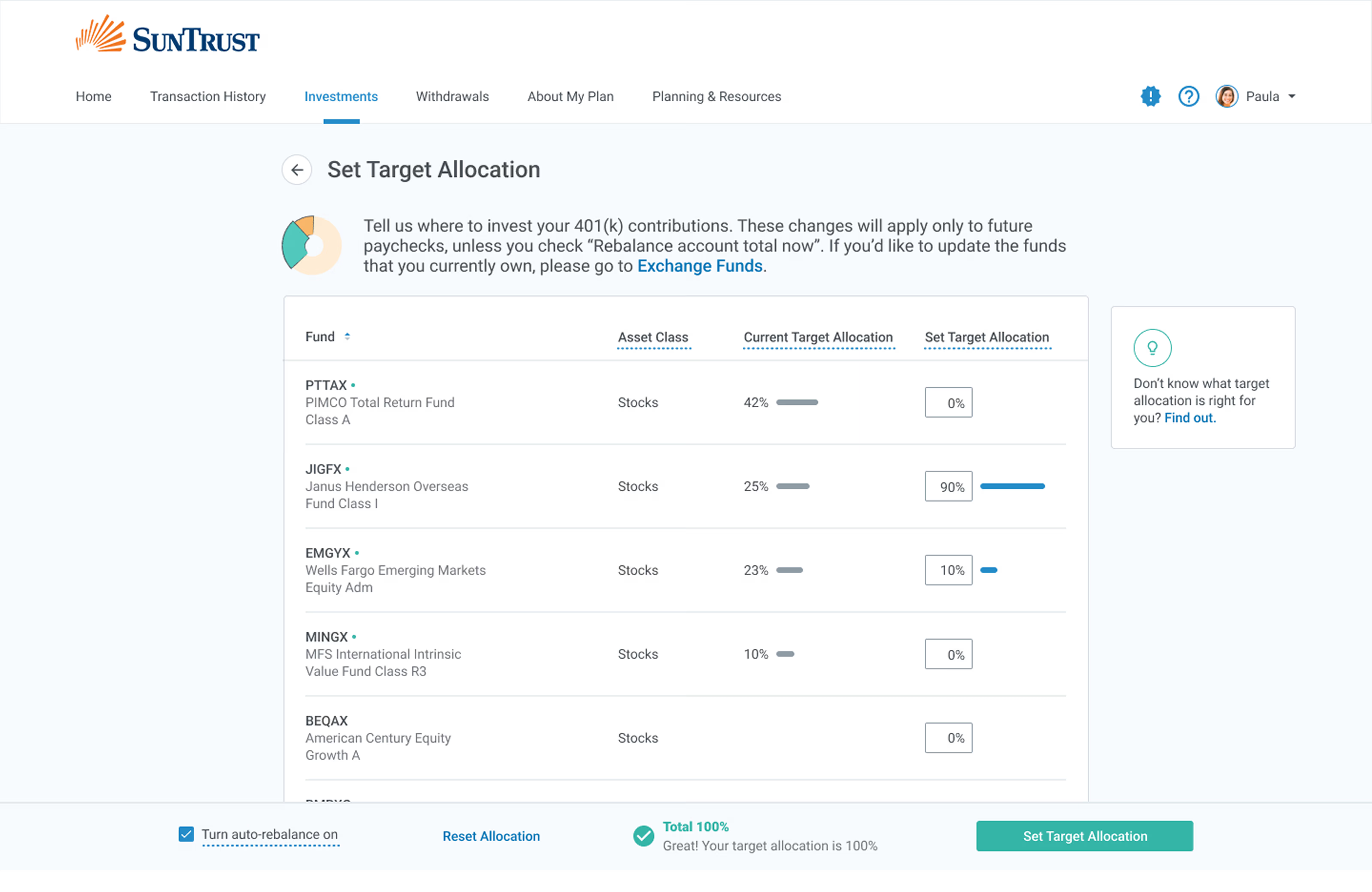
Testing also exposed three things I hadn’t thought of: splitting Roth and Regular balances apart, clearer step sequencing in the Set Investments flow, and the CSV/XLS export for the power users. All three made it into the final build.
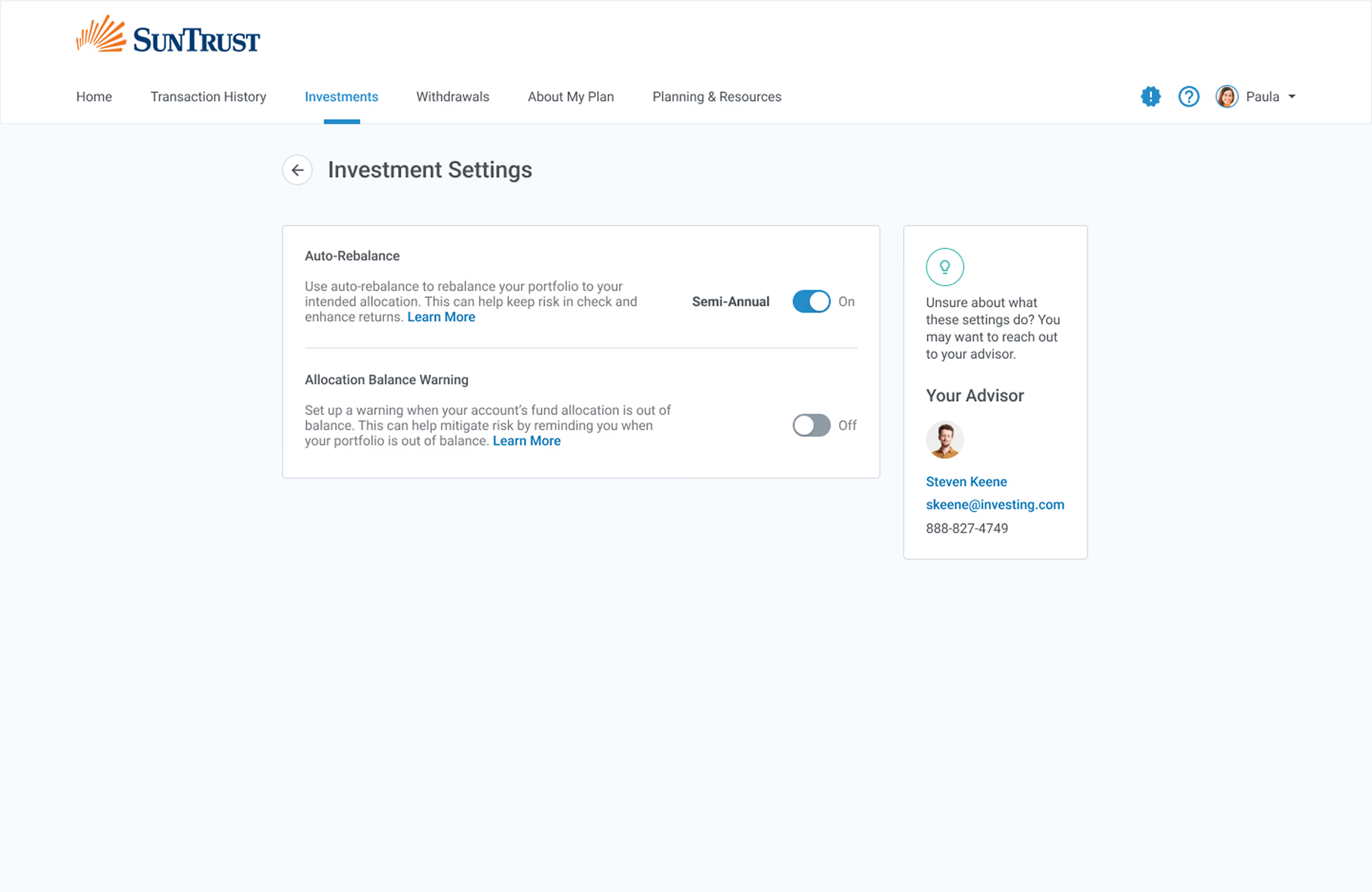
When I moved to hi-fi designs, I focused on two things. First, keeping viewing and taking action apart. And second making the system state clear at every step as the user is taking action.
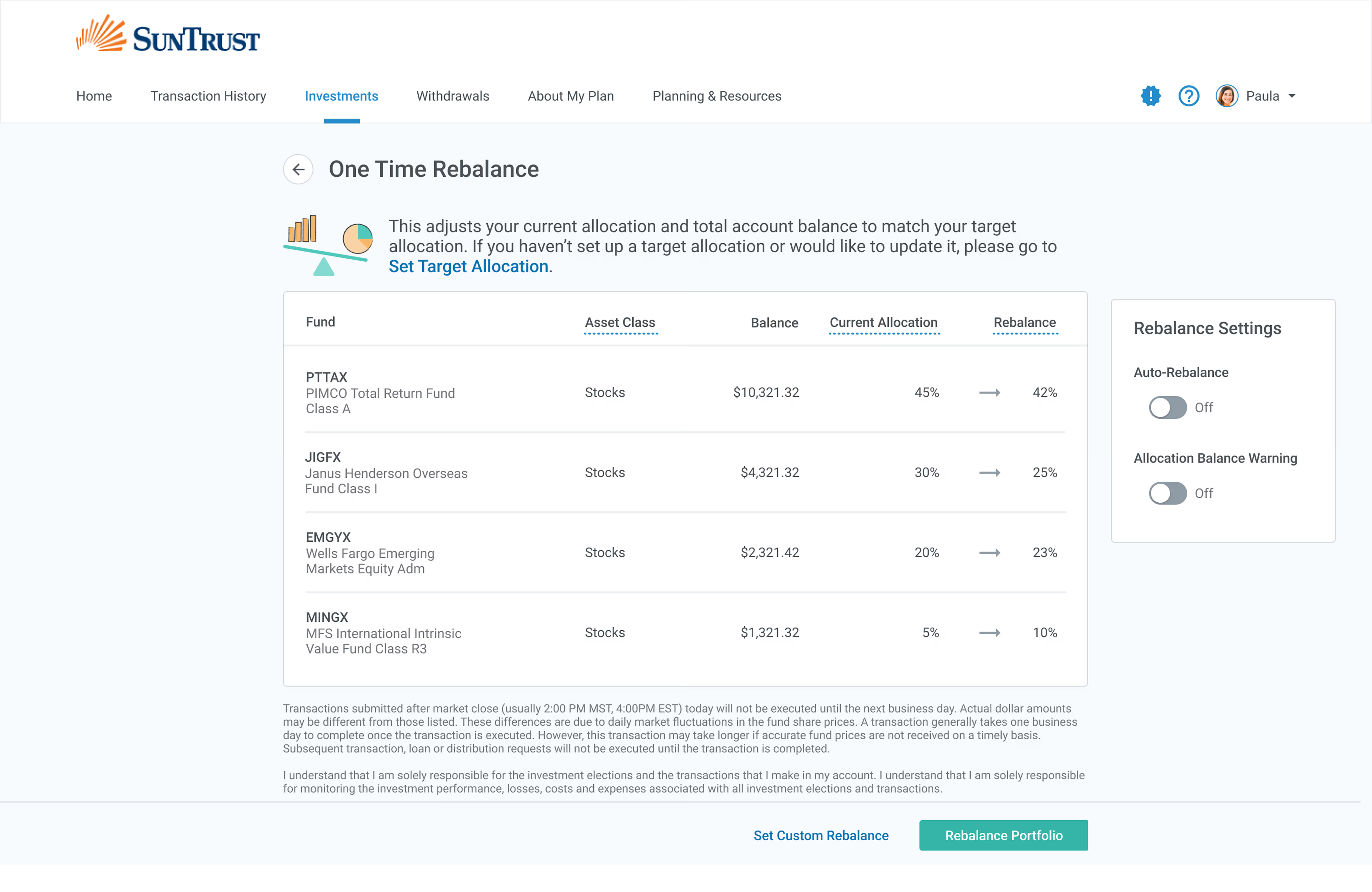
“I want to be able to dig into my investments more.”
WHAT HAPPENED
After one month, it was clear the numbers were moving in the right direction.
The figures below come from one month of post-launch data against a three-month pre-launch benchmark.
−60%
error rate during investment management tasks.
−29%
inbound support requests.
+25%
user satisfaction, from in-product surveys.
+21%
use of the embedded financial literacy tools.
THE SHIPPED EXPERIENCE /
WHAT I'D KEEP, WHAT I'D CHANGE
Two things I learned from this project.
WHAT I'D KEEP
Recruit for the range, not the median.
Designing for the first time investor and the monthly-auditing accountant in the same product forced structural calls a single-persona approach wouldn't have addressed. The recruiting a diverse set of research participants wasn't just methodologically the right approach, but it's what shaped the redesign of the IA.
WHAT I'D CHANGE
Measure the success criteria over a longer period of time.
We measured one month of post-launch data and compared it to a three-month benchmark and this indicated that directionally, this redesign was working. However, I'd want a second or third month before treating the design as causal. Next time I'd extend the measurement plan instead of letting the launch feel like the finish line.
NEXT CASE STUDY — 001
Districts were renewing $1.5M in app licenses on gut feel.